

Overview
Fit2day is a responsive fitness web application where users can fully customize their workout and fitness experience, regardless of their current fitness level. Users can search and view routines, guides, daily challenges, and other information on any device. They can also keep a schedule by adding sessions to their personal calendar. This was a student project for my UX Immersion course at Career Foundry.
Role
UI/UX Designer, focusing primarily on UI design
Tools
Figma, Principle, Invision, Sketch
Duration
2 months
Scope
As this project was focused on UI design, I was given a foundation which included all user research. Using this as my groundwork, I went through the my process beginning with user flows to fully design the app, focusing mainly on the ideate-polish stages of the process.
The Process


Objective
Motivate people into an exercise routine that suits their level, schedule, and interests.
Context
Firstly, finding exercise routines for your level can be difficult, especially if you want to try something new. This responsive web app aims to help people get into an exercise of their choice by holding their hand a bit and providing routines, guides, interactive examples, and info.
Secondly, finding routines that fit into your schedule is not easy. The web app is designed to encourage people who want to exercise get into an easy routine for physical activities. This means fitting in as little as a 5-minute routine.
The 5 Ws of Fit2day
WHO - People who are new or returning to fitness, want to find activities they like, and get into a good routine will be interested in Fit2day.
WHAT - A responsive web app is best for Fit2day, as users can search and view routines, guides, daily challenges, and other information on any device. They can also keep a schedule by adding sessions to their personal calendar.
WHEN - As the web app aims to get users into a routine that suits them, the web app can be used whenever they like. They will use the web app while they are searching for, scheduling, and following routines.
WHERE - When on the go or when practicing exercise routines at home, in the park, on the street, etc. Users can stay fit anywhere, as long as they’re logged in on a device.
WHY -
To become healthy and enjoy the associated benefits (better mood, weight management, reduce risks of illness, learning something new)
Exercise should be fun and suited to each user
To save time by fitting exercise into daily routines, such as walking or cycling to work or school


User Stories
As a new user, I want to learn about different exercises, so that I can figure out what is best for me.
As a frequent user, I want to complete daily challenges, so that I can have an additional way to stay motivated.
As a new user, I want to be shown how the exercises are done, so that I know I’m doing them correctly.
As a frequent user, I want to track progression and record what I’ve done, so that I can see my progress over time.
As a frequent user, I want to be able to earn achievements or rewards, so that I can stay motivated.
As a frequent user, I want to be able to share routines with my friends who may also be interested, so that I can encourage them to become healthier.
As a frequent user, I want to be able to schedule exercises for working out, so that I build positive habits.
Persona

User Flows
This stage in the process is where my work as a UI designer began. Using the user stories written for me I illustrated multiple user flows which helped me better understand how Rebecca would be completing the most crucial tasks of the app. Below are examples of 3 user flows.
User Story:
As a new user, I want to learn about different exercises, so that I can figure out what is best for me.
Entry Point:
Google Search
Success Criteria:
User views recommended exercises

User Story:
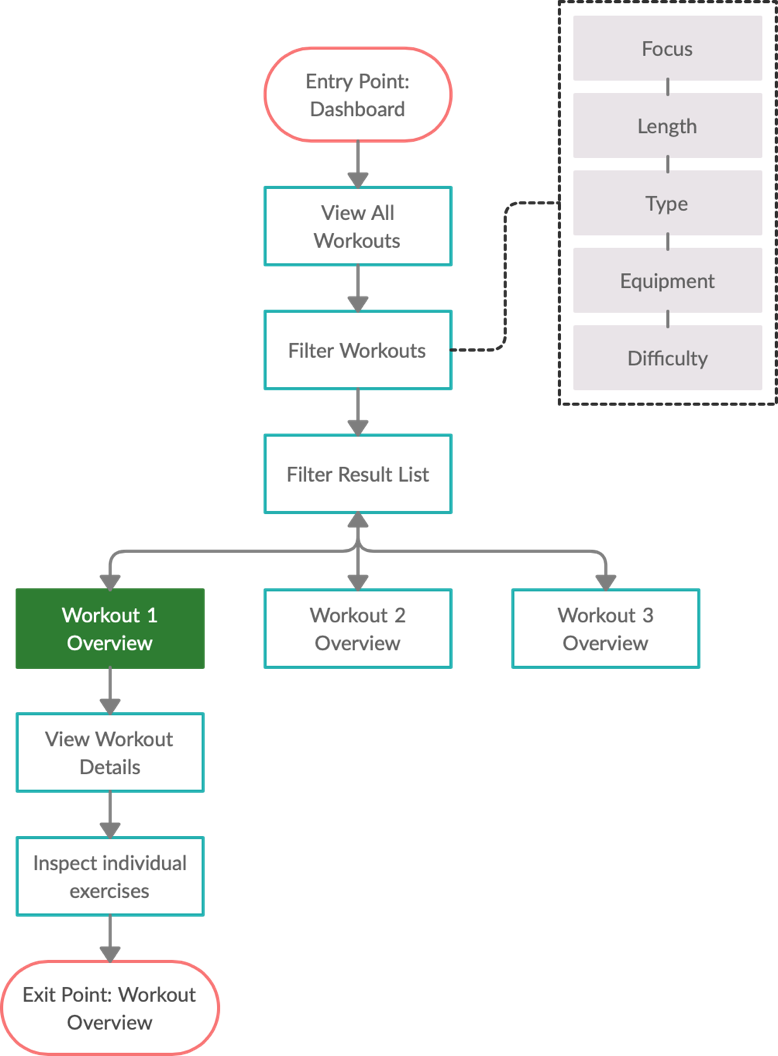
As a new user, I want to be shown how the exercises are done, so that I know I’m doing them correctly.
Entry Point:
Dashboard
Success Criteria:
User is able to inspect and learn about different exercises in a workout.
User Story:
As a frequent user, I want to be able to schedule exercises for working out, so that I build positive habits.
Entry Point:
Dashboard
Success Criteria:
User is able to schedule a workout to do at a later date.


Low Fidelity Wireframes
After writing user flows for all of the key features of Fit2day, my next step was to begin getting ideas onto paper by drawing up wireframes. I prefer to use pen and paper for this initial ideation phase, as it allows me to get my ideas down quickly and troubleshoot effectively.

Low Fidelity Paper Prototype
In order to properly structure and visualize the user interactions within the app, I used my user stories and flows as a basis for a paper prototype. Below we see a paper prototype of the user story: As a new user, I want to learn about different exercises, so that I can figure out what is best for me.
Mid-Fidelity Prototype
After fully prototyping the app with pen and paper, I transferred the wireframes to digital format in order to add more detail and copy to the screens. Here again we see the user story: As a new user, I want to learn about different exercises, so that I can figure out what is best for me.


Moodboard
At this phase in the process it was time for me to begin thinking about how I wanted the app to look and feel. To begin this process, I created 2 moodboards, each with a different feeling and aesthetic. While putting together both moodboards I wanted to make sure each option retained the fun aspect, while exploring 2 different spectrums of exercise moods: modern and playful vs. tough and traditional. For the purpose of this app, taking into account my persona being new to working out, I decided a more playful design would help with overall user retention and satisfaction.
UI Exploration
Before making any final decisions on typography, imagery, or color, I found it important to conduct a brief exploration of each of these UI aspects. Using this method of experimenting with a multitude of different styles helped me evaluate which elements would be appropriate for the app.
Typography Exploration
The 2 fonts I decided on for headings and body texts respectively are Barlow and Open Sans. Barlow is a slightly rounded and low-contrast font which helps to evoke a fresh emotion. Open Sans is an extremely legible and neutral font which pairs nicely with Barlow and will offer the user easy to read body texts.
Imagery Exploration
When exploring different fitness imagery I found a tendency for the images to evoke a hard feeling. Because Fit2day should cater to people who are new to working out, I wanted to make sure the imagery was not intimidating to new users. I chose option 1 in this exploration, and created the following imagery guidelines:
Imagery in Fit2day should be bright and laid back. The people in the images should invoke a feeling of joy that they are working out. Images should not be dark or display people with serious and hard facial expressions.
Color Exploration
Lastly, I decided to explore 3 different color palettes in order to finalize the interface style I was going for with Fit2day. Ultimately I chose palette option 1, as the colors are bright and well balanced, and they arouse an energetic and fresh feeling which I found in my moodboard.
Style Guide
Using the insights gained from my UI exploration, I put together a style guide to facilitate a cohesive design language system throughout the application. Elements included in the style guide are branding, colors, typography, UI elements, iconography, imagery, and copy guidelines.


With the foundation acquired in the exploration phase of my design process I was ready to apply the style guidelines to all screens in Fit2day and create a high fidelity prototype, adding all finishing touches to the app.
Animation
One way to add life to a prototype is by using animation, and in this case I chose to animate a loading screen for the exercise finder feature. The animation is simple but effective and helps evoke the clean and energetic mood of Fit2day.

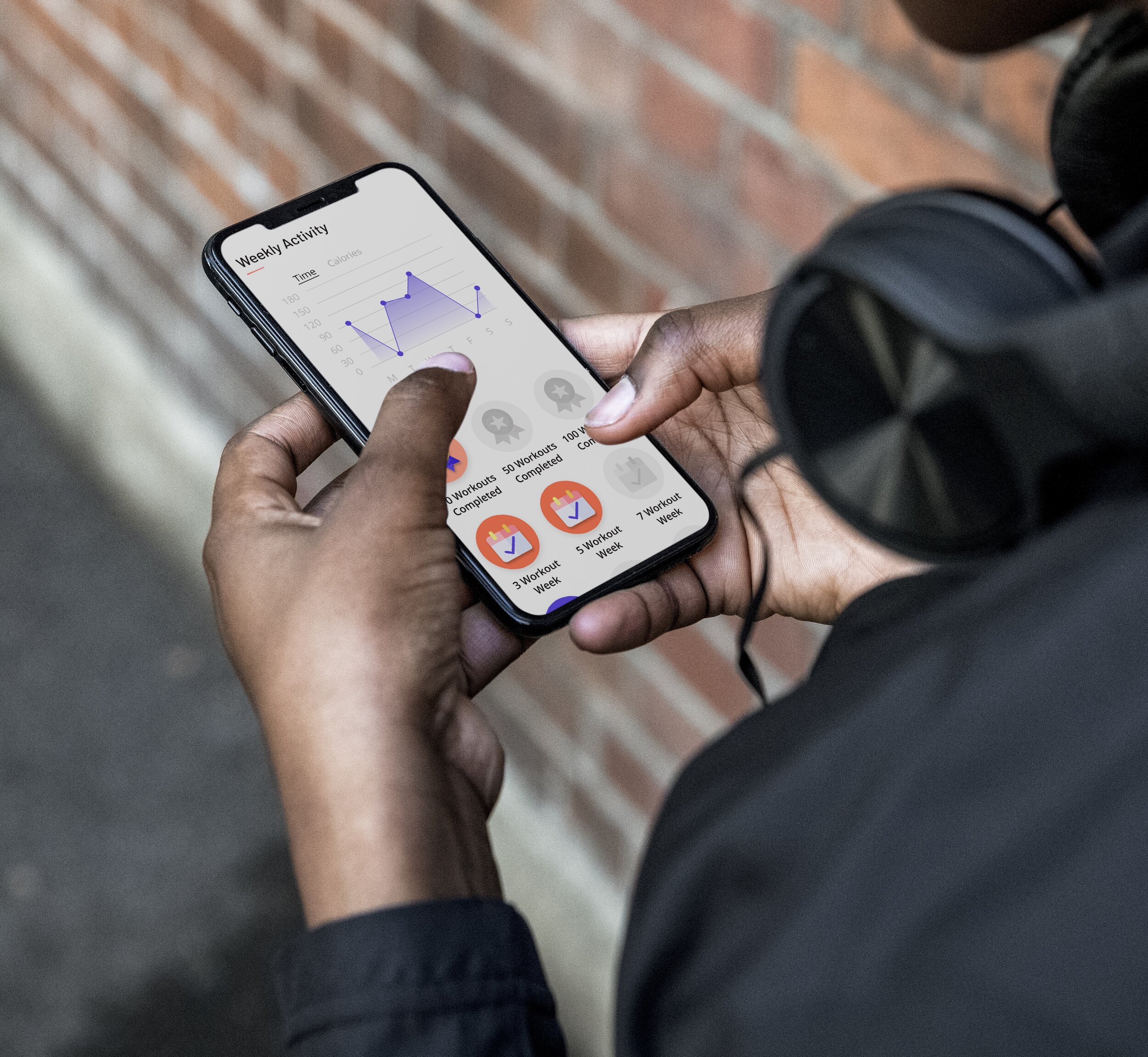
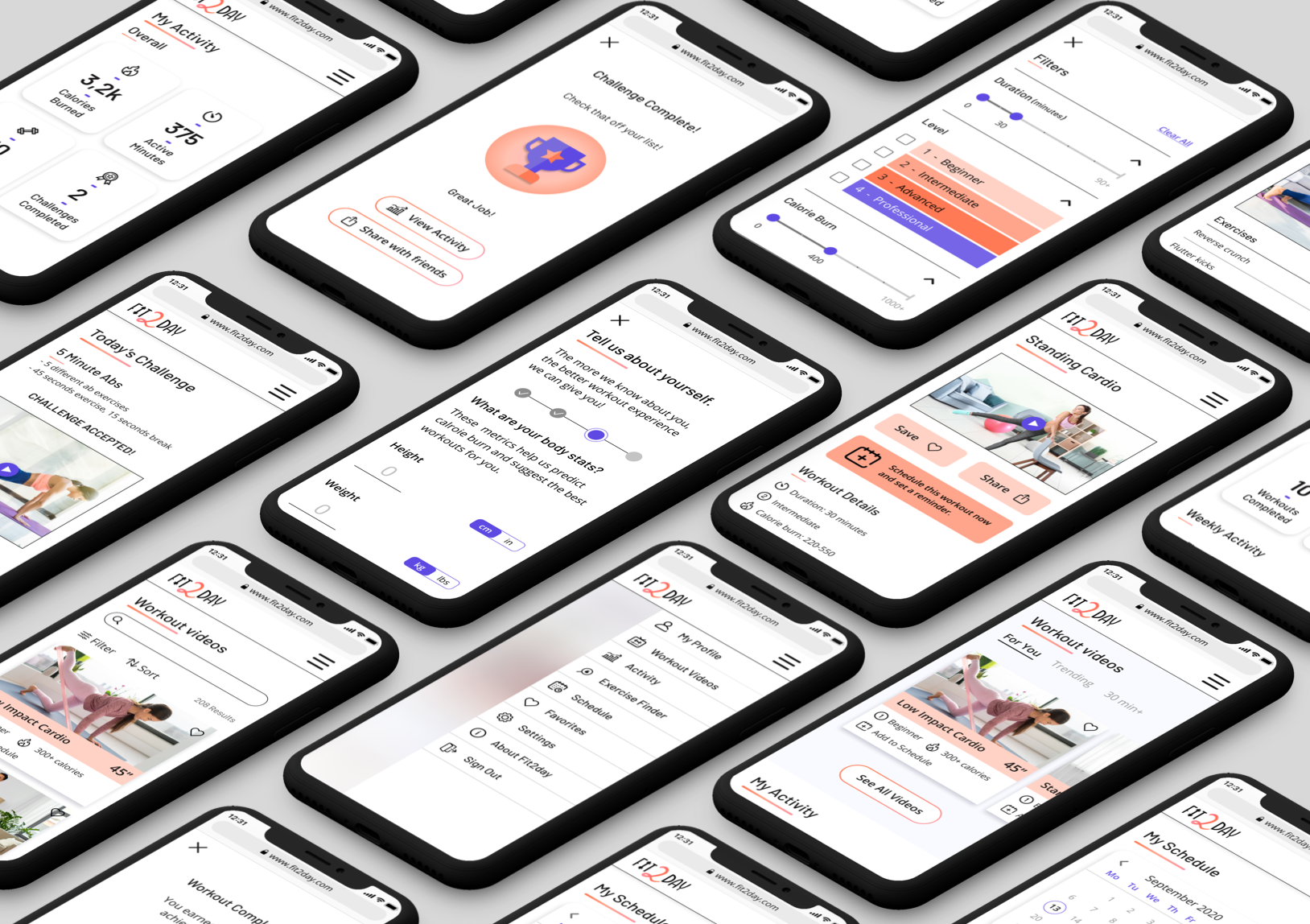
High Fidelity Prototype

At this point all screens have now been designed to follow the Fit2day style guide and include all high fidelity UI elements. Below you can see the final version of the user story: As a new user, I want to learn about different exercises, so that I can figure out what is best for me.
High-fidelity clickable prototype
In order to simulate the user’s experience, I fully prototyped all screens designed for Fit2day. Click the button below to view the prototype.
Design Evolution
To help illustrate the evolution of the design transitioning from low to high fidelity I have included 2 screens each in 4 different stages which show the iterative design process used throughout this project.


No matter how polished, no project is ever finished, especially not before user testing! My number one priority going forward is to conduct a sample of user tests, make revisions and enhancements, and follow up with A/B and preference testing. After receiving input from my users I will finish out the prototype by designing all remaining screens.
Thank You
